Cards
Cards are surfaces that display content and actions on a single topic. They should be easy to scan for relevant and actionable information. Elements, like text and images, should be placed on them in a way that clearly indicates hierarchy. Card layouts can vary to support the types of content they contain.
Example
Card Anatomy
Cards look and behave the same across both mobile and desktop. The card container is the only required element of a card. All other elements are optional. Use the drop-down to see more examples.
Positioning Guidelines
Content Positioning Example
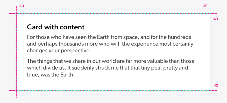
The minimum guides below give an example of how to position content within a card. It is important to remember to give content white-space. The margin and padding can differ depending on the type of content on the card but must be consistent within the same card.
Usage
Cards
Cards can be used to support a variety of layouts and follow these 3 principles. We should be careful not to use too many cards and always consider the visual hierarchy of the interface.


Best Practice
Styling
- A card can stand alone, without relying on surrounding elements for context.
- All cards should look and behave consistently across the digital platform. The styling should not change.
- Cards can expand and contract to the proportions of the information that they hold.
- Cards can present information left-aligned or centralised.
- Dividers can be used to separate regions in cards or to indicate areas of a card that can expand.
- Cards can be elevated to give information it contains prominence. (See elevated card example in the drop-down)
- Cards should not be used for complex elements like menus.
Use cards to contain related content and information. (See Law of Proximity and Common Region)
Use dividers to separate content into groups or sections.
Left align or centralise card content.
Cards can be used on any coloured background.
Don’t right align content within a card.
Don’t use cards for singular elements like titles or headings.
Don’t change the styling of cards.
