Colour Contrast Checker
Colour and contrast can be used to help all our users, especially those with varying levels of visual impairments. It supports our users to see and understand content, interact with the right elements, understand actions, and help communicate mood and tone.
For information, see our accessibility principles page
Sample Text
"The power of the Web is in its universality. Access by everyone regardless of disability is an essential aspect"
Tim Berners Lee
Enter the hex code for each colour or use the colour picker, to find out if these are accessible.
Explanation
This tool follows the Web Content Accessibility Guidelines (WCAG). These are a set of recommendations for making the web more accessible. There are two levels of contrast ratio:
AA - Minimum contrast
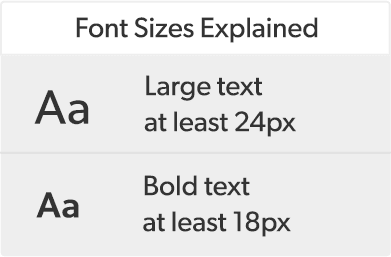
Contrast ratio of at least 4.5:1 for normal text and 3:1 for large or bold text.
AAA - Enhanced contrast
Contrast ratio of at least 7:1 for normal text and 4.5:1 for large or bold text.
Contrast Ratio
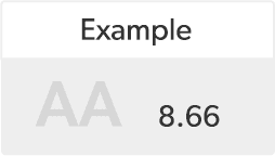
This represents how different one colour is from another, typically written as 1:1 or 21:1.
The greater the difference is between the two numbers, the better the contrast.
Useful Resources
Below are some useful plugins that can be used to test your designs and get an insight into how colours can affect people with different levels of visual impairments:

