Tooltips
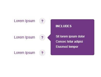
Tooltips display additional information about a page element or feature. They are usually triggered when users hover, focus, tap or click.
Example
Tooltips should be treated as annotations - they can help explain something.
Best Practice
Copy
- Tooltips can contain a header and body copy, or just body copy.
- For smaller tooltips, only use body text.
- Should be written in sentence case.
- Where possible, keep the text short - fewer than 150 characters and no more than two/three lines of body text to make for easier reading. If the text needs to be longer, consider using a modal window.
Exits
- This can be an “x” button, or it can be triggered by how a user interacts with a certain element.
Desktop Behaviours
- Desktop tooltip - on click.
- Tooltips appear in the centre of click targets and stay in place while the cursor moves within the target area.
Mobile Behaviours
- Desktop tooltip - on tap.
- Tooltips appear upon tapping and holding a screen element or component.
Tooltip Positioning
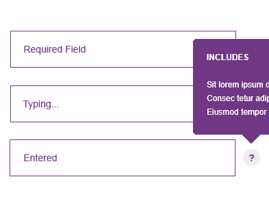
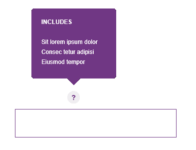
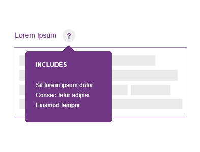
- Tooltips have four standard positions; top, right, bottom, and left.
- Test the tooltip positioning to make sure that the content does not block other information crucial to the user’s goal.
- Be aware of tooltip positioning. Covering up important parts of the page can feel more invasive than helpful.
Use arrows to clearly identify which element the tooltip is associated with when there are numerous nearby elements.
Position the Tooltip so that it center-aligns itself along the appropriate axis and appears outside the target element.
Accessibility
Accessibility in design allows users of diverse abilities to navigate, understand, and use your UI.
Only display one tooltip at once.
Support all gestures. Be inclusive and ensure tooltips are accessible via keyboards.
Use tooltips consistently throughout our sites. If tooltips are randomly used throughout our sites, people may never discover them.
Use tooltips for interactive imagery.
Adding an explicit tooltip icon or button. This can be helpful for complex or novel interfaces where you expect users to need help, or for adding touch behavior on mobile.
Don’t use tooltips for vital information that is essential for task completion.
Use tooltips to reiterate visible UI text.
Use shadows in tooltips.
Display imagery on tooltips


