Visual Design
Visual design focuses on improving the user experience through considering the effects of space, layouts, and colour on the usability of digital products and their aesthetic appeal. Visual design explorers a variety of concepts such as unity, Gestalt properties, space, hierarchy, balance, contrast, scale, dominance, and similarity.
Purpose
Visual design makes our interfaces more consistent and reduces cognitive load. This leads to increased user responses and behaviours that suit the use and purpose of the digital product. Good visual design does not take away from the content of the page. It enhances it by engaging users and helping to build trust and interest in the brand.
Benefits
The key benefits of good visual design across digital products.
- Consistency eliminates confusion, meaning less effort is required from the user
- User recognition will increase meaning they will quickly learn how to use the interface.
- Visual clutter and complexity are reduced meaning the consumption speed of information is increased.
The aesthetic usability effect states that users o en perceive aesthetically pleasing design as design that’s more usable.
Retrieved from https://lawsofux.com/aesthetic-usability-effect
Elements of visual design
An overview of the basic elements of visual design and how to apply them.
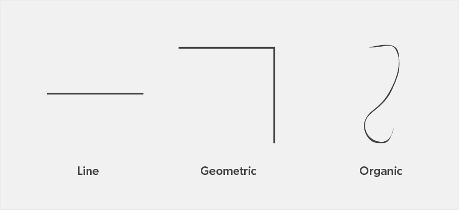
Lines
Lines are used to connect two points and are the most basic element of visual design. We can use them to create implied shapes. Lines are simple but can convey different emotions by using different properties such as thickness, non-uniform width or taper. A simple use of a line can be to separate content as a divider, to make it easier to consume.
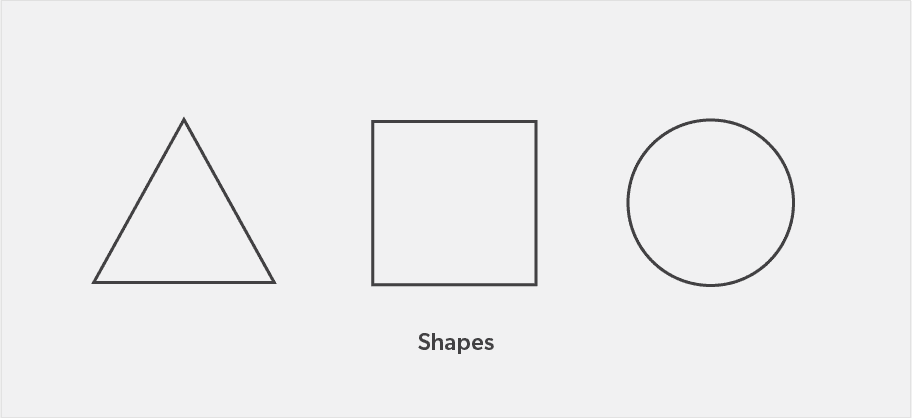
Shapes
Shapes are self-contained areas formed by lines, colours or texture. We recognise objects by their simplest shapes. People perceive and interpret ambiguous or complex shapes in their simplest form possible, because it is the interpretation that requires the least cognitive effort.
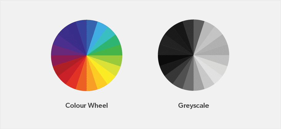
Colour
Colour can be used to differentiate items, create depth, add emphasis and to organise information. Many designers believe that colour is purely an aesthetic choice, but this isn’t true. Certain colours portray different moods and emotions and can impact users in different ways. Colour psychology is a key aspect of creating a good colour palette that works well in digital design.
Texture
Texture refers to how a digital surface is perceived to feel. Depending on how a texture is applied, it may be used strategically to attract or deter attention. Material design by google is inspired by the physical world and its textures such as how they cast shadows and reflect light.
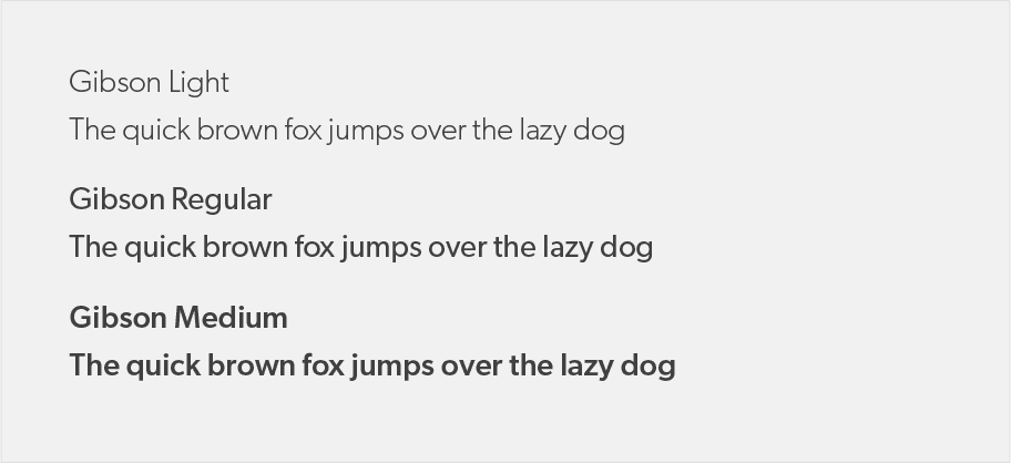
Typography
Typography is the font that is used, its size, tracking, alignment, weight, scalability, x-height, colour and spacing. Typography is an integral and powerful part of design; it facilitates legibility and encourages reading.
Fundamentals of visual design
Successful visual design applies the following fundamental concepts to its design elements.
Unity
Unity has to do with all elements on a page visually or conceptually appearing to belong together. Visual design must strike a balance between unity and variety to avoid a dull or overwhelming design.
Gestalt
Gestalt, also known as the law of proximity, helps users perceive the overall design as opposed to individual elements. If the design elements are arranged properly, the Gestalt of the overall design will be very clear.
Space
Space is defined as the area around elements sometimes referred to as white space or negative space. Incorporating space into a design helps reduce noise, increase readability, and create an illusion. White space is an important part of your layout strategy.
Hierarchy
Hierarchy shows the difference in significance between elements. Hierarchies are created through different font sizes, colours, and placement on the page. Usually, items at the top are perceived as most important.
Contrast
Contrast focuses on making items stand out by emphasizing differences in size, colour, direction, and other characteristics. It also contributes heavily to accessibility. See accessibility considerations
Dominance
Dominance focuses on having one element as the focal point and others being subordinate. This is often done through scaling and contrasting based on size, colour, position, shape, etc.
Similarity
Similarity refers to creating continuity throughout a design without always direct duplication. Similarity is used to make pieces work together consistently over an interface and help users learn the interface quicker.
Material Design
Material design defines the qualities that can be expressed by UI regions, surfaces, and components.
Why Material Design?
Material Design encompasses subtle skeuomorphism, which sets it apart from flat design and makes it more intuitive for many users. Material is built on the premises of user-friendly features such as user feedback in the form of haptic feedback and subtle animations. It has a simplified sense of physics, which makes interactions more intuitive to the user as they represent how the real world operates. Nebula design system borrows certain components and design methods from material design.
Cards
Cards are surfaces that display content and actions on a single topic. They should be easy to scan for relevant and actionable information. Elements, like text and images, should be placed on them in a way that clearly indicates hierarchy. Card layouts can vary to support the types of content they contain. See card component
Anatomy
The card container is the only required element in a card. All other elements that can be used within a card are optional. Card layouts can vary to support the types of content they contain. The following elements are commonly found among that variety.
Dividers
Dividers can be used to separate regions in cards or to indicate areas of a card that can expand. Dividers can be used to group content and create hierarchy.
Elevation
A card’s default elevation is 2dp, with a raised elevation of 8dp. This is illustrated by a drop shadow or box-shadow. Elevation mimics objects in the real world as they occur with natural shadows.
