Accessibility
We care about creating designs that are inclusive, serving as many people as possible. While accessibility is a core objective, inclusion means much more - we also think about things like the environment and cognitive load.
Purpose
The concept focuses on enabling access for people with disabilities, or special needs, or enabling access through the use of assistive technology; however, research and development in accessibility brings benefits to everyone.
Benefits
Avoiding Discrimination - Increase Your Audience
- 71% of web users with a disability will simply leave a website that is not accessible.
- The Equality Act and its predecessor – the Disability Discrimination Act: Legally protects people from discrimination in the workplace and in wider society.
Better SEO (Search Engine Optimization)
- When you incorporate accessibility features into your website (such as alt text for images), your Search Engine Optimization also improves.
- Useability For All Improvements of accessible design offer advantages for all users.
Inclusive - We could tap into 20% more customers.
There are over 11 million people in the UK, 1 in 5 people have a disability - this could be visual, hearing, motor or cognitive (affecting memory and thinking). Over half of the population over the age of 65 experience some kind of disability.
Retrieved from https://www.ons.gov.uk/peoplepopulationandcommunity/healthandsocialcare/disability/articles/nearlyoneinfivepeoplehadsomeformofdisabilityinenglandandwales/2015-07-13
Key Aspects
Disabilities can be thought of as a mismatch between one’s ability and one’s environment, and can be broken into three main types
Situational
A person with typical vision might struggle to view their screen in a bright environment. Or, a new parent with their focus split between multiple tasks.
Temporary
A person with a broken arm may not be able to type but will regain the ability when healed.
Impairment Types
Cognitive
Cognitive and learning disabilities impact how people process information. For example, they can affect people’s perception, memory, language, attention, problem solving, and comprehension. Terminology for categories and conditions varies, and includes intellectual disabilities, developmental disabilities; attention deficit hyperactivity disorder (ADHD), autism, dementia, dyslexia, and more.
Long-lasting: Autistic Spectrum | Dyslexia | Anxiety | Attention deficit hyperactivity disorder (ADHD) | Learning difficulty
Temporary: Injury | Illness
Situational: Noisy Room, Distractions
Motor
Motor disabilities are weakness and limitations of muscular control. These include: involuntary movements including tremors, lack of coordination, paralysis, limitations of sensation, joint disorders such as arthritis, pain that impedes movement, and missing limbs
Long-lasting: Physical Disability | Athritis
Temporary: Injury | Illness
Situational: On the move, Train, Car
Visual
Visual disabilities can range from mild or moderate vision loss in one or both eyes to substantial or complete loss of vision in both eyes. Some people experience reduced or lack of sensitivity to certain colors or color blindness, as well as sensitivity to brightness. Color-blindness affects 8% of all men and 0.4% of women.
Long-lasting: Visual Impairment | Colour Blind
Temporary: Injury | Illness
Situational: Bright Sunlight | Small or low quality screens
Tools
We need to accommodate the range of tools that people use when using our services. Browsers provide settings to increase font size and colours so people can make text more legible. Screen magnifiers allows us to make interfaces even bigger. Screen readers convert text to audio to enable people who can’t see to hear content instead. Speech recognition software allows people to operate a computer without the use of their hands.
Accessibility Considerations
Accessible design not only hellps users with disabilities; it provides better user experiences for everyone.
Colour Contrast
WCAG standards (Web Content Accessibility Guidelines)
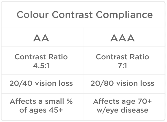
Meeting the AA requirement is sufficient for the majority of users. The AA requirement constitutes a contrast ratio of 4.5:1 to compensate for the loss of contrast sensitivity by users with a 20/40 vision loss. A study found the “majority of persons maintain at least fair acuity (20/40 or better) into their eighties” (source). This finding suggests that meeting the AA requirement will make your text accessible to the majority of users.
WCAG 2.0 level AA requires a contrast ratio of at least 4.5:1 for normal text and 3:1 for large text.
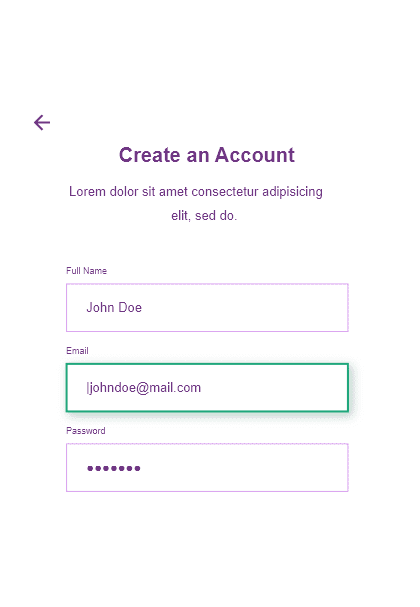
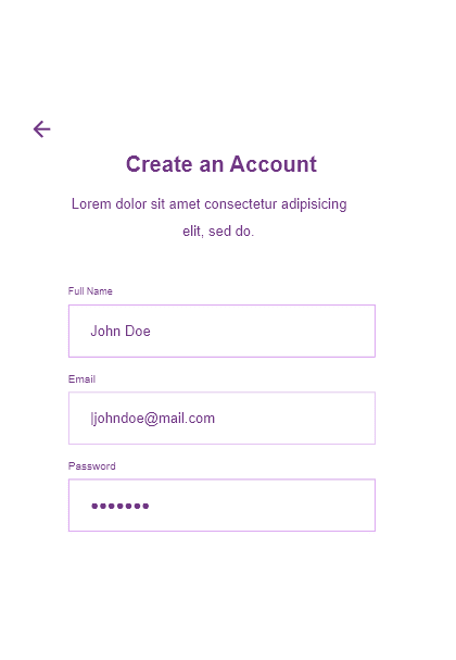
WCAG 2.1 requires a contrast ratio of at least 3:1 for graphics and user interface components (such as form input borders).
WCAG Level AAA requires a contrast ratio of at least 7:1 for normal text and 4.5:1 for large text.
Large text is defined as 14 point (typically 18.66px) and bold or larger, or 18 point (typically 24px) or larger.
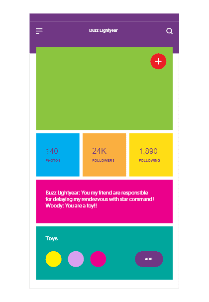
Make sure text has enough contrast.
White on a light colour even with a drop shadow is not sufficient to be legiable for most people.
Please use an accessibility contrast checker if you are unsure:
Bright Colours
Those on the autistic spectrum can find bright or contrasting colours very distracting.
Too Many Colours
By limiting the use of colour the areas that do receive color gain more attention, such as text, images, and individual elements like buttons.
Font Sizing
There’s no official minimum size font for website use. However, it’s usually recommended that you use at least 16px font for the body text. While that’s a good start for the body portion, the headers should feature larger text and some text can be smaller (between 10px and 14px).
There are two main concerns when working with font sizes:
- Ensuring that default font sizes are not too small.
- Ensuring that text can be expanded to 200% on websites.
Best Practice
The best practice is to set the font-size on the html to 100%, and then set all the other elements to either em or rem which will be relative to the body size. Let’s say someone has an impaired vision and sets their browser’s default font size to something larger. Setting the base font size in our CSS to pixels will overwrite their browser default font size setting. Instead of seeing most of the text at a larger font size, we now force them to read it at 16 pixels size. That’s because pixels are an absolute unit and not a relative one.
Text Style
To improve accessibility and legibility and avoid confusion, websites should use as few fonts as possible.
Avoid decorative or overly stylized fonts, which are often difficult to read even for users without visual impairments or reading disabilities.
Don't centre-align long paragraphs
When we have lines of text that are of unequal length and they’re center-aligned it makes it extremely hard to find the beginning of the next line. Again, put impaired vision or reading disorders on top of that and it becomes nearly impossible to read. Don’t center-align paragraphs that are longer than 2 or 3 lines of text.
Left aligned text has a straight edge each line starting at the same place.
There can be no thought of finishing for ‘aiming for the stars.’ Both figuratively and literally, it is a task to occupy the generations.
And no matter how much progress one makes, there is always the thrill of just beginning.
As I stand out here in the wonders of the unknown at Hadley, I sort of realize there’s a fundamental truth to our nature, Man must explore...
and this is exploration at its greatest.
Never in all their history have men been able truly to conceive of the world as one: a single sphere, a globe, having the qualities of a
globe, a round earth in which all the directions eventually meet, in which there is no center because every point, or none, is center —
an equal earth which all men occupy as equals. The airman’s earth, if free men make it, will be truly round: a globe in practice, not in theory.
Centred text has a ragged left edge, each line starting at a different place making it difficult to track to the next sentence.
There can be no thought of finishing for ‘aiming for the stars.’ Both figuratively and literally, it is a task to occupy the generations.
And no matter how much progress one makes, there is always the thrill of just beginning.
As I stand out here in the wonders of the unknown at Hadley, I sort of realize there’s a fundamental truth to our nature, Man must explore...
and this is exploration at its greatest.
Never in all their history have men been able truly to conceive of the world as one: a single sphere, a globe, having the qualities of a
globe, a round earth in which all the directions eventually meet, in which there is no center because every point, or none, is center —
an equal earth which all men occupy as equals. The airman’s earth, if free men make it, will be truly round: a globe in practice, not in theory.
Divide your content into easily-digestible paragraphs
Long paragraphs are hard to read for people with reading disorders. Try to divide your content into short paragraphs, avoid really long paragraphs or what’s even worse—long sentences in long paragraphs.
Long paragraphs can be hard to read
There can be no thought of finishing for ‘aiming for the stars.’ Both figuratively and literally, it is a task to occupy the generations. And no matter how much progress one makes, there is always the thrill of just beginning. As I stand out here in the wonders of the unknown at Hadley, I sort of realize there’s a fundamental truth to our nature, Man must explore... and this is exploration at its greatest.
Divide your content into short paragraphs
There can be no thought of finishing for 'aiming for the stars.'' Both figuratively and literally, it is a task to occupy the generations. And no matter how much progress one makes, there is always the thrill of just beginning.
As I stand out here in the wonders of the unknown at Hadley, I sort of realize there’s a fundamental truth to our nature, Man must explore... and this is exploration at its greatest.
Touch Target
Touch targets are the parts of the screen that respond to user input. They extend beyond the visual bounds of an element. For example, an icon may appear to be 24 x 24 dp, but the padding surrounding it comprises the full 44 x 44 dp touch target.
For most platforms, consider making touch targets at least 44 x 44 dp. A touch target of this size results in a physical size of about 9mm, regardless of screen size. The recommended target size for touchscreen elements is 7-10mm. It may be appropriate to use larger touch targets to accommodate a larger spectrum of users.
Retrieved from https://lawsofux.com/fittss-law.html
Interaction Feedback
Visual Cues
Because colorblindness takes different forms (including red-green, blue-yellow, and monochromatic), multiple visual cues help communicate important states. Elements such as strokes, indicators, patterns, texture, or text can describe actions and content.
Provide a redundant visual cue for users who may not be able to discern a difference in colors.
Because colorblindness takes different forms (including red-green, blue-yellow, and monochromatic), multiple visual cues help communicate important states.
Rely solely on visual characteristics such as shape, size, visual location, or orientation to convey meaning.
Focus States
Some people use keyboards or other devices to navigate through a page by jumping from one interactive element to the next. Focus states let users know which element they’re currently on and is ready to be interacted with.
Alt Tags
ALT text refers to invisible description of images which are read aloud to blind users on a screen reader. Adding ALT text allows authors to include images, but still provide the content in an alternative text based format. Using alt text on your images can make for a better user experience, but it will also help earn you SEO benefits.
Use the phrases "image of…" or "graphic of…".
Decorative images still need an alt attribute, but it should be null (alt="").
Keep it (relatively) short. The most popular screen readers cut off alt text at around 125 characters, so it's advisable to keep it to that character count or less.
ARIA Labels
The Web Accessibility Initiative's Accessible Rich Internet Applications specification (WAI-ARIA, or just ARIA) is good for bridging areas with accessibility issues that can't be managed with native HTML. It works by allowing you to specify attributes that modify the way an element is translated into the accessibility tree.
ARIA provides several mechanisms for adding labels and descriptions to elements. In fact, ARIA is the only way to add accessible help or description text. From the perspective of assistive technologies, ARIA gives authors the ability to dress up HTML and SVG elements with critical accessibility semantics that the assistive technologies would not otherwise be able to reliably derive.
Some of ARIA is like a cloak; it covers up, or overrides, the original semantics or content.
<a role="menuitem">Assistive tech users perceive this element as an item in a menu, not a link.</a>
<a aria-label="Assistive tech users can only perceive the contents of this aria-label, not the link text">Link TextG</a>
Stying States with ARIA
When you build components, it's common practice to reflect their state, and thus their appearance, using CSS classes controlled with JavaScript.
For example, consider a toggle button that goes into a "pressed" visual state when clicked and retains that state until it is clicked again. To style the state, your JavaScript might add a pressed class to the button. And, because you want good semantics on all your controls, you would also set the aria-pressed state for the button to true.
A useful technique to employ here is to remove the class altogether, and just use the ARIA attributes to style the element. Now you can update the CSS selector for the pressed state of the button from this
toggle.pressed { ... }
to this.
.toggle[aria-pressed="true"] { ... }
This creates both a logical and a semantic relationship between the ARIA state and the element's appearance, and cuts down on extra code as well.
Video
Web accessibility standards such as the Web Content Accessibility Guidelines (WCAG) require websites to have closed captions and transcripts for all prerecorded audio and video content. Higher levels of WCAG compliance also require captions for live audio and video content, and even sign language interpretation for prerecorded content.
